

Today, we’re introducing our refreshed design across Buffer. Our new navigation, and updated visual language give creators and businesses more flexibility as social media continues to evolve.
Our goal has been to make Buffer feel calmer, clearer, and easier to work in every day.
A few weeks ago, we wrote about our aim to offer a smarter, more insightful Buffer: a toolset that helps more creators and businesses make smarter decisions around their social media strategies. But that’s only one part the story of Buffer in 2026.
As creators ourselves, we at Buffer believe we can do more to help build momentum when working on social media. And momentum is not created by forcing it, but with a mix of calm, insight, and flexibility for the different businesses and content out there.
These are the principles that we are bringing to our new design for Buffer.
You know that feeling after rearranging your furniture? Everything is still the same underneath, but the space suddenly works better for you
Opening Buffer today might feel a bit like that.
A new navigation, updated brand colors, and typography to create a lighter, calmer interface that’s easier to move around. This update doesn’t change what Buffer does for you today, but gives us a stronger foundation for what comes next.
Why the redesign?
Buffer began with a simple goal: make social media publishing easier. Over the last year, you may have noticed us quietly evolving with a new look on the marketing site, updated campaigns, and a refreshed homepage. Today, the product catches up. This redesign is the moment it all comes together as one cohesive thing.
Social platforms are often chaotic public squares, driven by algorithms that are difficult to understand and discourse that often polarizes. We know from our users (and ourselves) how challenging this can be to work through when trying to build a brand or a business.
This chaos isn’t where we do our best work, and we know it’s the same for Buffer customers. We’ve been leaning into turning Buffer into a space to support momentum on social media, and that momentum comes from a combination of ease, flexibility, insight, and, of course, a calm space.
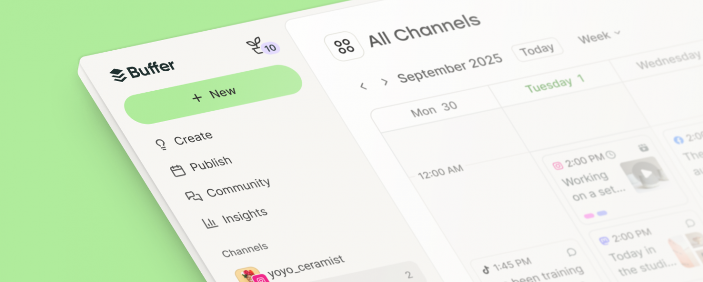
A new navigation
0:00
One of the main reasons creators come to Buffer is simplicity, and we take that very seriously. But over the years, Buffer expanded, and as the product grew, things started becoming more complicated than they needed to be. It became clear that the structure we originally built Buffer on was limiting what the product needed to become.
The redesign gives us a much stronger foundation moving forward:
A centralized sidebar
Our main features are now clearly organized in one place. Users can easily switch between channels, groups, contexts, and work types. This makes it easier to stay in flow and build a workflow that fits the way each person works, whether you’re planning content, engaging with your community, or analyzing results.
Product consistency
Creators starting from zero can quickly understand how to plan, publish, and engage without feeling overwhelmed by changing layouts or scattered tools. At the same time, professionals managing many accounts and channels have more flexibility and visibility into their work.
Space to grow
The redesign creates room for the next generation of features we’re building. Things like smarter scheduling, deeper insights, AI assistance, and tools that help creators sustain momentum over time.
A new design language
Buffer has never been the corporate type. We always leaned toward the unconventional. A little quirky, independent, curious. Comfortable challenging the rules of how software and work are supposed to look and feel. As the product evolved, the brand and interface didn’t always keep up.
With this refresh, we wanted to bring that spirit back and apply it consistently across everything: our brand, marketing site, web product, and mobile apps.
Getting there took time, and you may have already caught some of it through the work of our marketing team to evolve the brand in public. Some of the things we changed include:
A visual identity that lets the content take center stage.Warm neutral tones create a calm setting.A vibrant Buffer green adds positivity and helps guide attention without overwhelming the interface. As Kate Baldrey, Marketing Designer, shared, “We went through what felt like thousands of iterations to find a green that felt unique and Buffery without leaning too neon or earthy, and eventually found a shade that felt vibrant enough but balanced and grounded when paired with our neutral tones.”Playful pastel accents introduce moments of personality and meaning.Softer shapes and lighter typography create a more friendly and spacious feel.Simpler illustrations are designed to support the experience, not overpower it or add visual noise.
The goal wasn’t to reinvent Buffer’s identity, but to bring it back to its origins and make it support where we want to go.
There’s more to come
Our mission remains the same: help creators and businesses get off the ground and grow. To publish consistently, understand what works, and grow without feeling like they’re constantly fighting the system. That won’t change. But how we get there is evolving. This redesign is the first step toward the product we want Buffer to become.
I’m incredibly proud of what this team has accomplished with so much care, attention to detail, and empathy for the people who use Buffer every day. And we’re grateful to the creators who shared their feedback and helped shape this along the way.
We hope you’ll follow along on the journey.