All those cool widgets and embeds you like because they make your site “better”. You know the chatbox, Yelp reviews carousel, the fly-in Instagram imbed that looks like a 90s PowerPoint slide, that neat jQuery-driven social share widget &c, those are making your site slow, and that’s bad for both UX and SEO.
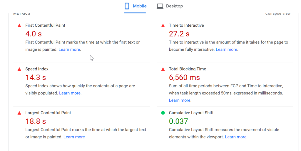
It doesn’t matter how visually beautiful and functional your site is on a large monitor with hardwired fiber internet. It matters that the site takes 30 seconds to become interactive on mobile with a fairly average 4g connection.

Reduce the number of fonts, and trim the functionality that only matters to you mercilessly. Remember, GeoCities was bad, so a polished version of the same pointless bloat is also bad. “But what about our branding?” you ask. Branding matters, but are those seven different Google font faces integral to your branding?
Don’t worry that people won’t follow you on Instagram without that embedded IG widget, won’t contact you if the chatbot doesn’t appear, or won’t trust you if you don’t load the reviews from a third-party site. Worry that no one will wait 30 seconds to take any action.
People will forgive a lot, but slow sites speed tends not to be overlooked by humans or search engine crawlers. It doesn’t matter if most of your traffic is from desktop browsers; in September 2020, Google switched fully to mobile-first indexing. It’s worth noting every update Google (no matter how much AI is used) has rolled out in the past five years seems to place a greater priority on mobile site performance.
In rare cases, that one widget will increase the conversion rate enough to be worth the trade-off in speed. But, at an added .5-2 seconds of mobile load time a pop, how many of them do you really need? You can have that Zemanta tracking scrip, if you use it. But as a general rule, you cannot do things that make your site notably slower negatively impacting your site’s ranking in Google search and increase your overall conversions, even if you somehow increase your conversion rate.
Run a few pages of your site in PageSpeed Insights, and hold your breath for the length of time listed as “Time to Interactive,” if that is even remotely unpleasant, start optimizing.
In summary trim all the features that no one really wants because you think they look nice or will slightly increase conversion rates. On this, UX and SEO are very much in alignment, and both are saying, keep it stupid simple.
Header: “‘The Simple Life’” by Chrismatos ♥90% OFF, sorry is marked with CC BY 2.0.
—
Mason Pelt is the founder of Push ROI
The post Keep It Stupid Simple, The Website UX Philosophy SEO Supports appeared first on Push ROI, Inc..


