

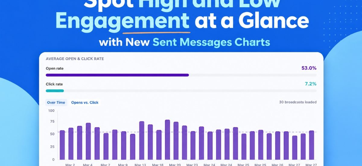
Open rates, click rates, and email comparisons appear as a chart you can view at a glance. See which emails drove action and which ones didn’t. Then send more of what works.
Patterns and outliers surface at a glance, no digging required.
See engagement trends over time
The Opens and Clicks Over Time chart plots up to 100 of your most recent broadcasts on a visual timeline. The toggle lets you switch between opens and clicks to compare performance across sends. A subject line that keeps drives opens, a send day with higher engagement than the rest. Patterns like these show up here fast.
Click-to-jump links any bar directly to that broadcast in the table below. From a spike in the chart to the exact message in seconds.
The chart loads automatically. As you scroll and load more broadcasts, they populate the bar chart.
See your strongest and weakest sends side by side
Switch to the Opens vs. Clicks bubble chart to see your most recent sends plotted together. Each broadcast appears as a bubble, sized by send volume, so you can compare results across different audience sizes without losing context.
Outliers surface fast here. You’ll see which broadcasts earned strong opens but fewer clicks, and which ones drove both. That tells you what to repeat and what to adjust.
Collapsible chart view keeps the chart out of the way when you want to focus purely on the numbers in the table. Expand it again whenever you want the visual context back.
Filter down to exactly what you want to measure
Date presets let you pull the past 30 days, 90 days, or full year with one click. The chart updates immediately to show only those sends.
Dynamic search filtering goes further. Type in the search bar and the chart narrows to only broadcasts with that word in the subject line, so you’re comparing exactly the sends you care about.
Segment name filtering is coming soon too. You’ll be able to isolate chart and table data by segment, which matters since engagement naturally varies by audience.
These charts extend the broadcast analytics available in the AWeber MCP app for ChatGPT and Claude.ai, bringing that same view directly into your Dashboard. For more on tracking performance over time, see how to track and improve your email marketing performance and how to improve your email open rates.
Your Sent Messages charts are live now in AWeber.
The post Spot High and Low Engagement at a Glance with New Sent Messages Charts appeared first on AWeber.