
The big picture
Picture this: The CMO asks what employee advocacy did for pipeline last quarter. Someone on the social team then spends an afternoon exporting reports, lining up date ranges and pasting charts into a slide. By the time it’s done, the follow-up question is already waiting.
To enable marketing teams to move quicker, Anthropic released Claude Dashboards in beta, and Oktopost customers can use it with their social data starting today!
So, those long afternoons of reporting can now start with a single question.
Below is what the feature does, how to connect Oktopost to it, and five dashboards worth building this week.
What Claude Dashboards is, and how Oktopost plugs in
Claude Dashboards builds dashboards from plain-language questions. A user describes what they want to see, Claude writes the query, runs it against the connected data and returns a dashboard. Each chart shows the query behind it and when it last refreshed, so anyone can check a number before it goes into a deck. Changes happen in conversation too: “make it weekly” or “filter to LinkedIn only” updates the view.
It’s in beta on paid Claude plans. On Enterprise, an owner has to switch it on first. Dashboards start private to the person who built them and can be shared with colleagues.
Besides data warehouses, Claude Dashboards can pull from apps already connected to Claude. That’s where Oktopost comes in.
Oktopost data reaches Claude through the Oktopost MCP server, which is added to Claude as a custom connector. Setup takes a few steps: add a custom connector in Claude, paste the Oktopost MCP server URL, then sign in to Oktopost to authorize the connection. On Claude Team and Enterprise plans, an organization owner has to add the connector at the org level first. The full steps are in Oktopost’s help center. The connection follows each person’s Oktopost role and permissions, so Claude only sees the data that user could already see in the platform.
Once it’s connected, Claude can read Social BI dashboards and reports, post analytics, advocacy board activity and the social inbox. Here’s what that makes possible.
5 dashboards to build first
See the five examples to build below:
1. Social-to-pipeline dashboard
This is the dashboard leadership asks for most and the hardest one to put together by hand. Oktopost’s Social BI already tracks leads and influenced opportunities from social, and Claude can pull those reports into a single view organized around the question being asked.
Prompt: “Build a dashboard showing leads and influenced opportunities from social by campaign for Q3, compared to Q2. Highlight the three campaigns that drove the most pipeline.”
The answer to “is social working?” arrives in revenue terms, which is how the CFO was going to judge it anyway.
One requirement: this dashboard depends on CRM attribution being set up in Social BI. Without a connected CRM, there’s no lead or opportunity data for Claude to pull, so teams that haven’t connected one yet should start with dashboards 2 through 5.
2. Employee advocacy program health
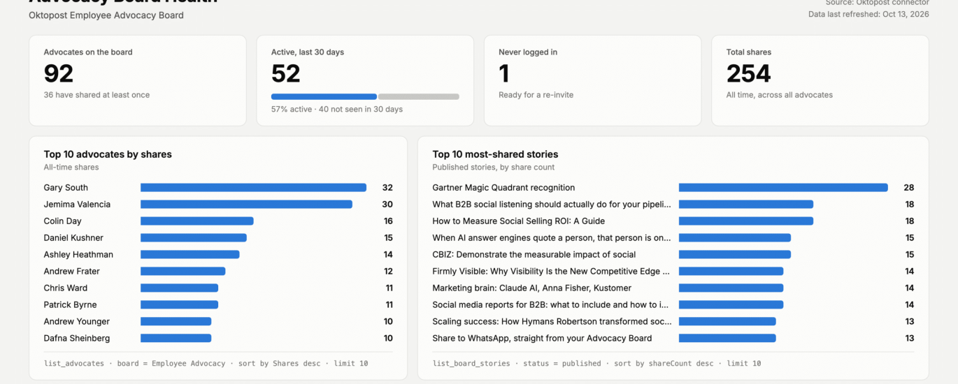
Advocacy programs fade quietly. A board can have 200 advocates on paper and 40 who actually share. The Oktopost connector exposes who has shared, who hasn’t logged in recently and which stories get picked up most.
Prompt: “Show our advocacy board health: active vs. inactive advocates (seen in the last 30 days), advocates who have never logged in, the top 10 advocates by shares, and the 10 most-shared stories.”
An advocacy health dashboard built by Claude from Oktopost data.
The never-logged-in list doubles as a re-engagement target list, and the top stories show what kind of content advocates actually want to post. For more on running the program itself, see Oktopost’s employee advocacy platform.
3. Brand page vs. employee reach
Prompt: “Compare engagement and clicks from our LinkedIn company page vs. employee advocacy shares, by week, for the last 90 days.”
Most B2B teams suspect their employees reach more people than the company page. This dashboard puts the two side by side.
It’s a useful chart for budget conversations. When employee shares consistently outperform the brand page, that’s a case for putting more content and attention into the advocacy program.
4. Campaign performance snapshot
A fast ranking of what’s working, by network, for a weekly team meeting or a quarterly review.
Prompt: “Rank this quarter’s campaigns by clicks and engagement rate, broken out by network. Flag any campaign that dropped more than 20% from last quarter.”
Asking for the flag in the prompt makes Claude point out what changed, so nobody has to compare two reports line by line.
5. Social inbox and response ops
Community and customer teams need a different view: what’s waiting for a reply, and where it’s piling up. Claude can count open and closed conversations from the Social Inbox by network, tag and assignee.
Prompt: “Show open vs. closed inbox conversations by network and tag for the last 30 days, and which team members have the most open items.”
It gives a team lead a quick daily check on whether anything important is going unanswered.
Start from the Social BI dashboards you already have
Most Oktopost customers already have Social BI dashboards they trust, and Claude can read them. That opens up a few practical options:
Ask questions of an existing dashboard. “Why did engagement dip in the second week of September?” gets an answer drawn from the dashboard’s own reports.
Combine several reports into one view for a specific audience. A CMO one-pager might pull the pipeline report, the advocacy summary and the top campaigns into a single page.
Change the cut without rebuilding. Switch to a different date range, network or region by asking for it.
Social BI stays the source of truth for social data. Claude adds a faster way to ask it questions and to shape answers for whoever needs them.
A few things to know before starting
It’s a beta. Expect the feature to change, and check numbers against Social BI before they go into a board deck. Each chart shows its query, which makes that easy.
Permissions carry over. The Oktopost connector only returns what each user’s role allows, so a regional manager’s dashboard shows that region’s data.
Plan access varies. Dashboards is available on paid Claude plans, and Enterprise owners enable it in their organization settings.
Admins may need to go first. On Claude Team and Enterprise, an owner adds the Oktopost connector for the organization before anyone else can connect.
Better prompts give better dashboards. Name the time frame, the comparison and what to flag. “Show social performance” gets a generic chart, while “compare Q3 to Q2 and flag drops over 20%” gets a useful one.
For a look at what happens when the Oktopost connector is used every day, read what happened when we gave an AI the keys to Oktopost.
In summary
Reporting should take a few minutes, freeing up the rest of the afternoon for deciding what to do next.
Claude Dashboards and the Oktopost connector let marketers turn report-building into a conversation that starts with one question.
The five dashboards above are a good place to start testing.
For more insights on connecting Oktopost to Claude, contact us to request a demo.
The post New: Build Claude dashboards with your Oktopost data appeared first on Oktopost.